
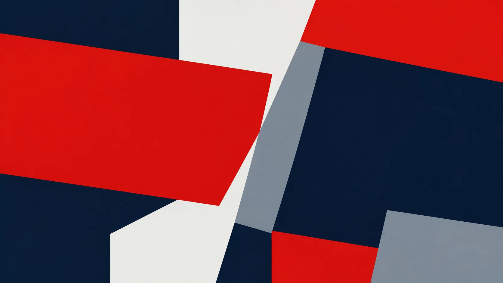
The painting in our featured image has no subject in the usual sense. Two red bands tilt across a field of dark navy, a pale grey plane cuts between them, and a white wedge opens up the middle. Every edge is clean. Every colour is flat, with no visible brushwork. It is the kind of picture that invites the reaction “anyone could do that”, and the long history behind it suggests otherwise.
Naming a style
In 1959 the critic Jules Langsner organised an exhibition in Los Angeles called Four Abstract Classicists, with work by Karl Benjamin, Lorser Feitelson, Frederick Hammersley and John McLaughlin. Around the show, Langsner used the phrase hard-edge painting to describe work made of flat, clearly bounded areas of colour.
The term stuck, and was soon applied far beyond California: to Ellsworth Kelly, Frank Stella, Al Held and many others. What linked them was not a manifesto but a set of refusals: no gestural brushwork, no illusion of depth, no hidden symbolism. The painting would be exactly what it appeared to be.
Kelly’s windows
Ellsworth Kelly is the artist most associated with the idea, though he disliked the label. He spent the years from 1948 to 1954 in France, and it was there that he found his method. Rather than inventing shapes, he took them from things he saw: the pattern of a window, the shadow of a railing on a staircase, the gap between two buildings. Window, Museum of Modern Art, Paris, made in 1949, is a two-panel construction of wood and canvas that reproduces the proportions of an actual window in the museum. It looks entirely abstract, and is in fact a kind of portrait.
This is the paradox at the heart of hard-edge painting. It looks invented and impersonal, but much of it begins in close observation of the world. The flat shape on the canvas is what remains of a long look at something else.
Kelly kept doing this for the rest of his life. He made hundreds of small collages and postcard studies, cutting shapes from magazines and laying them over photographs of landscapes, and he photographed barn doors, shadows on walls and the curve of a road with the same attention. Many of his large paintings began as one of these modest records. Seen together, they make a kind of diary of looking, written in edges rather than words.
Colour as a relationship
The other great lesson of the period came from the classroom. Josef Albers, who had taught at the Bauhaus and then at Black Mountain College and Yale, spent decades showing students that colour is never fixed. The same grey looks warm beside blue and cool beside orange. A red band seems to advance or recede depending on what surrounds it.
In visual perception a color is almost never seen as it really is, as it physically is.
Josef Albers, Interaction of Color, 1963
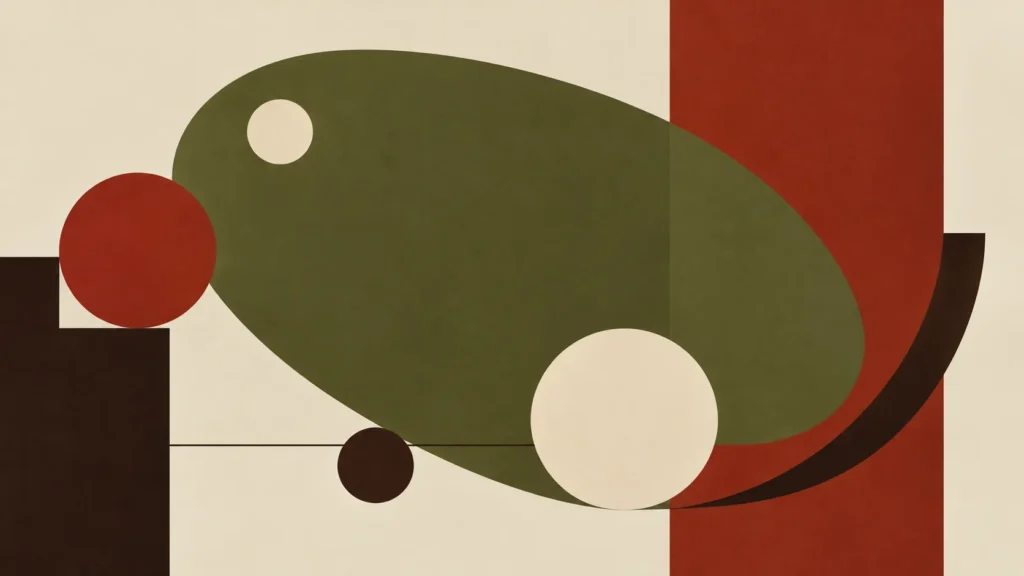
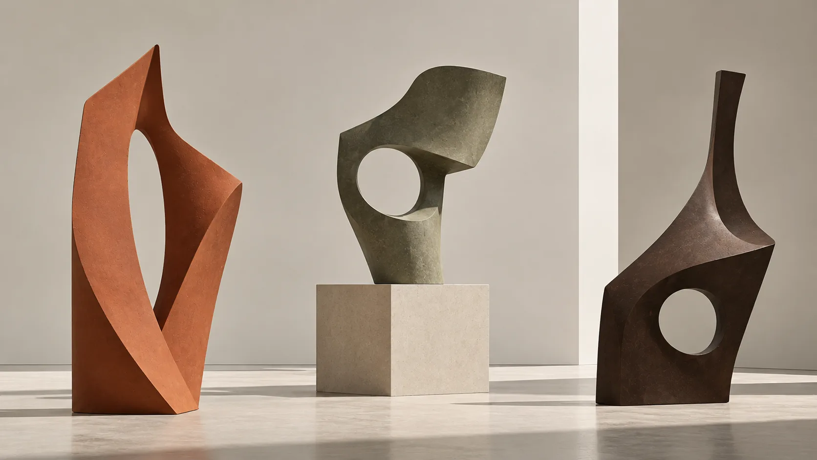
Hard-edge painting made this lesson visible on a large scale. Because the edges are sharp, nothing blends; every colour must hold its own against its neighbours, and the eye feels the pressure at each boundary. The image above, with its olive oval, red bar and cream circles balanced against one another, shows the same play of weight and tension in a softer, more organic register.
Living with flat colour
The influence of all this outside the gallery is so pervasive that it can be hard to see. Corporate identities, signage systems, book covers, the colour-blocked fashion of the 1960s, the interface of a smartphone: all assume that clean shapes and flat colours can carry meaning and feeling without ornament.
Kelly himself crossed into architecture at the end of his life, designing Austin, a small chapel-like building with coloured glass windows and black-and-white marble panels for the Blanton Museum of Art in Texas. It opened in 2018, after his death in 2015.
Standing inside it, under light filtered through squares of coloured glass, you understand that hard-edge painting was never about coldness. It was about clarity: the belief that a shape seen plainly, in the right colour and the right place, can be enough to stop a person in their tracks.



View comments (0)